

Cera: Home Care Management Ecosystem
Two native apps and an operations platform connecting caregivers, families and care coordinators.
Brief
Cera is a home care company that wanted to replace paper visit reports with a connected digital service. Caregivers filled in reports by hand, coordinators chased updates by phone, and families living elsewhere rarely saw them.
The goal was one ecosystem with three connected products: a Carer app for recording visits, a Family app giving relatives visibility into their loved one’s care, and a Digital Care Platform (DCP) where coordinators manage clients, caregivers, schedules and compliance.
One visit, three audiences
Every visit produces one shared record. The caregiver checks in, completes tasks and submits a structured visit report from the Carer app. The report lands in the DCP, where coordinators review it, flag concerns, follow up on incidents and adjust schedules and care plans. The Family app shows relatives a clear summary of the same visit, and lets them request extra visits or contact Cera.
Designing that one report for three very different audiences was the thread running through the whole project.

My role
I led UX across all three products and acted as the user advocate throughout. I owned the DCP end to end: research, audit, information architecture, flows and UI. On the Carer app, I audited the existing MVP, ran user interviews and testing, created personas and flows, redesigned the visit-reporting flow and produced the first UI iterations. For the Family app, I interviewed family members and defined the flows, features and screens.
When Cera brought in an external agency for the rebrand and final UI of the two apps, they built on my personas, flows and screens. I supervised the redesign to make sure usability, flows and the form logic survived the new visual layer.

Carer app
Most caregivers were women over 50 with limited mobile experience, moving from paper forms to an app. They rushed from one client to the next, so reports were often short and vague, which became a real problem once families would read them.
I mapped the existing MVP flow and marked every friction point, from pending visit requests to reports with no guidance.

Research
I audited the existing MVP and tested it with caregivers face to face: 45 minutes of interviews about their needs and frustrations, then 15 minutes testing the app.
From that I built personas and mapped the visit from check-in to check-out. Phone interviews with family members later did the same for the Family app.

My first designs used turquoise and purple, which I moved to Cera’s brand of yellow, grey, black and white. The agency then layered the final gradient visual language onto the same structure.

I broke the visit report into short, guided sections with clear options instead of free text, and made missing mandatory answers obvious before submission, so finishing a full report took less effort than leaving it half done.


Family app
Phone interviews with family members showed what they actually wanted to know: who is coming and when, whether the visit happened, and how their relative was doing. I designed the flows and features around those questions: schedule, plain-language visit reports, care plan, requesting extra visits and contacting Cera. The agency designed the final UI.
The Family app is live on the App Store and Google Play.

Digital Care Platform
The DCP is where coordinators run the service day to day. Before changing anything, I sat with coordinators over several sessions, watched them work and interviewed them about their flows, friction points and the features they wished they had. The audit showed a system full of features nobody used, while the tasks they repeated all day were buried.
I redesigned the entire system around those daily tasks:
-
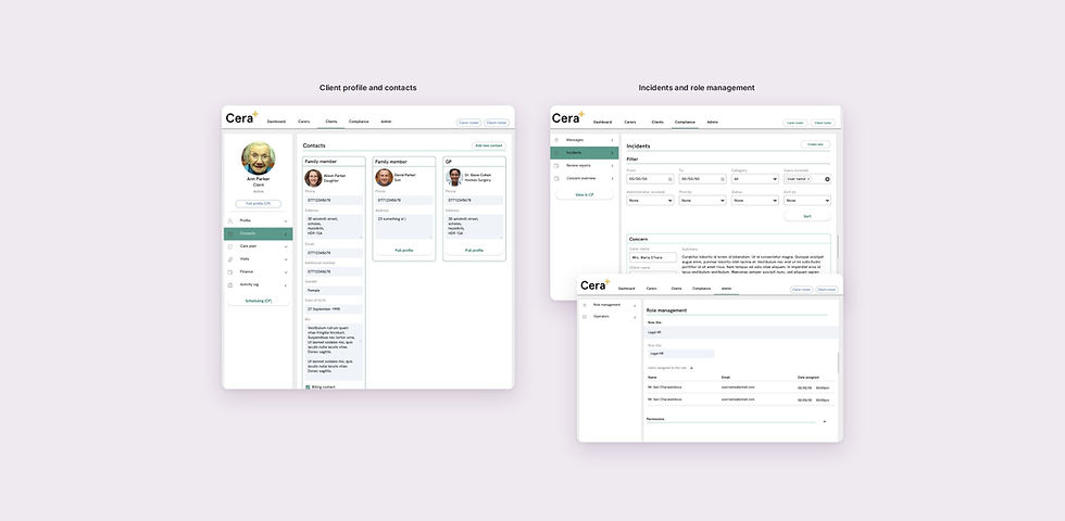
Client profiles with care plan, contacts and visit history in one place
-
Visit report review with concern levels, so issues surface quickly
-
Scheduling visits and assigning caregivers by availability
-
Caregiver profiles, availability, rosters and timesheets
-
Compliance reviews, incidents and messages to coordinators
-
Role management and permissions for operators


Results
Two native apps on iOS and Android and one operations platform, all connected. After launch, Cera reported these service-wide outcomes: 83% accuracy in predicting patient deterioration, a 35% improvement in medication compliance and a 17% reduction in patient falls. These are Cera’s own figures for the whole service, not a measure of my design work alone.
The Family app is live on the App Store and Google Play. The Carer app is used by Cera’s own caregivers.
Got a question?
We'd love to hear from you. Send us an email and we will get back to you shortly.
View Other Projects

